More than 9 million people and businesses around the world use MailChimp to send marketing email, automated messages, and targeted campaigns. Started in 2001 as a side project, MailChimp has quickly grown to be the industry leader in email marketing for small businesses and sends more than 600 million emails each day.
Market and customer demand were driving the need for MailChimp to develop a suite of features that allowed users to get more out of their email marketing.
The Solution
After evaluating 4 years of data science research and customer feedback the feature set was narrowed to Delivery Status, Comparative Reports, Multivariate Testing, Delivery Insight, Stop Delivery, and Advanced Segmentation. Over the course of 10 months I worked with 12 teams within MailChimp to create the most powerful set of features MailChimp has ever built.
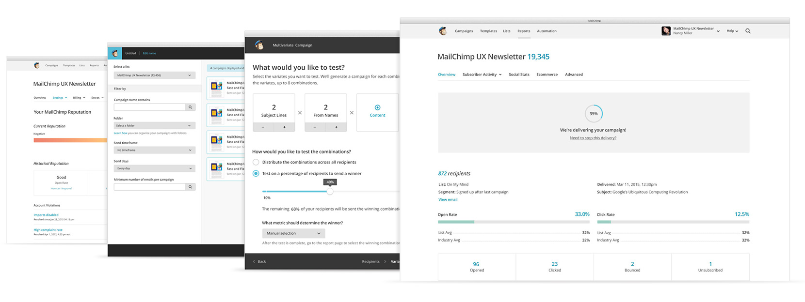
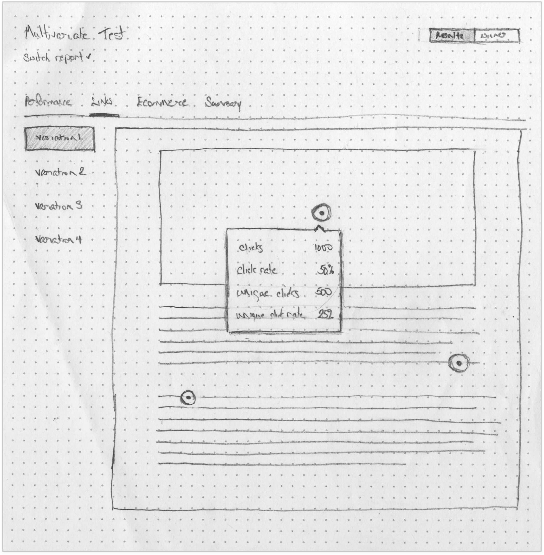
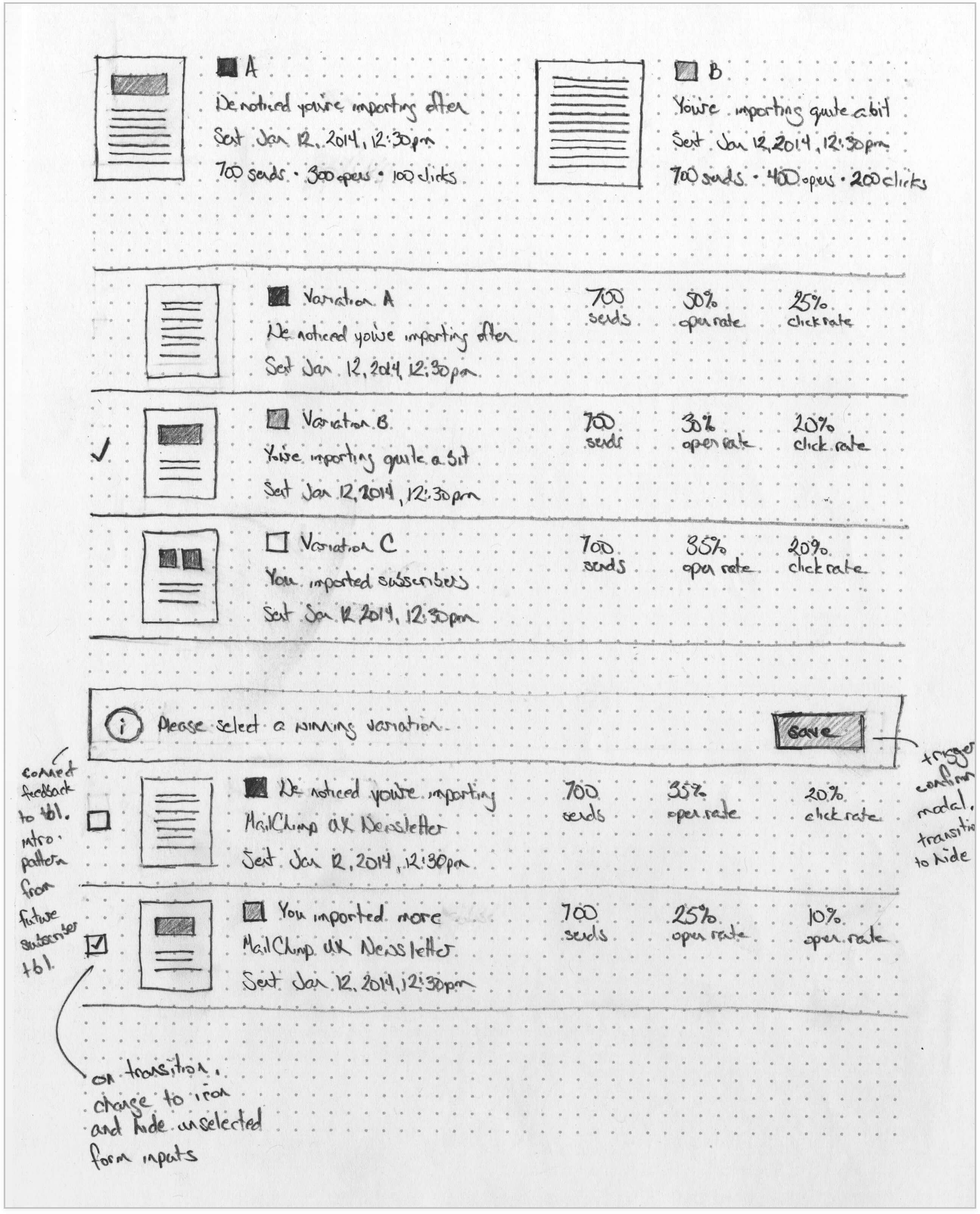
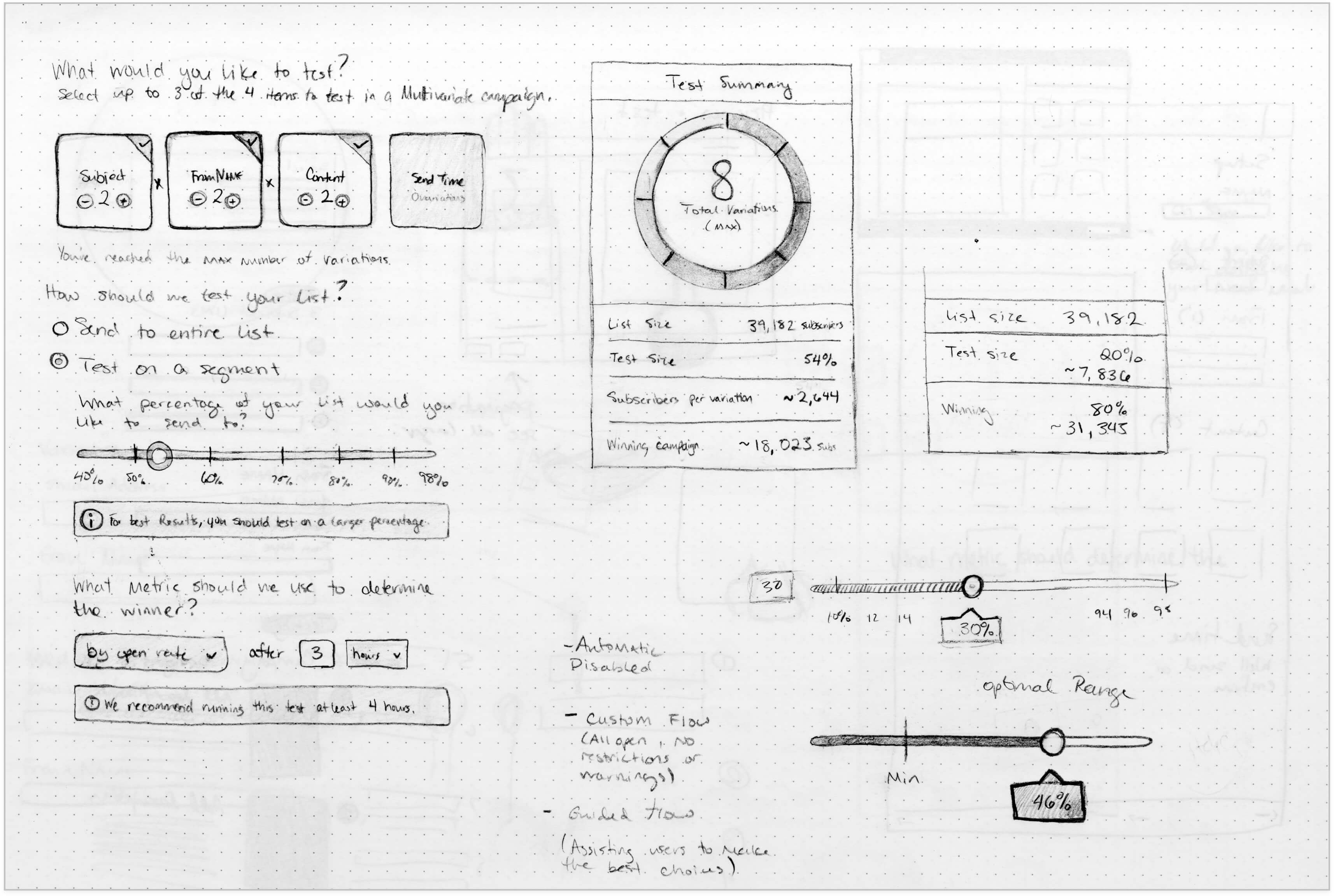
Multivariate Testing
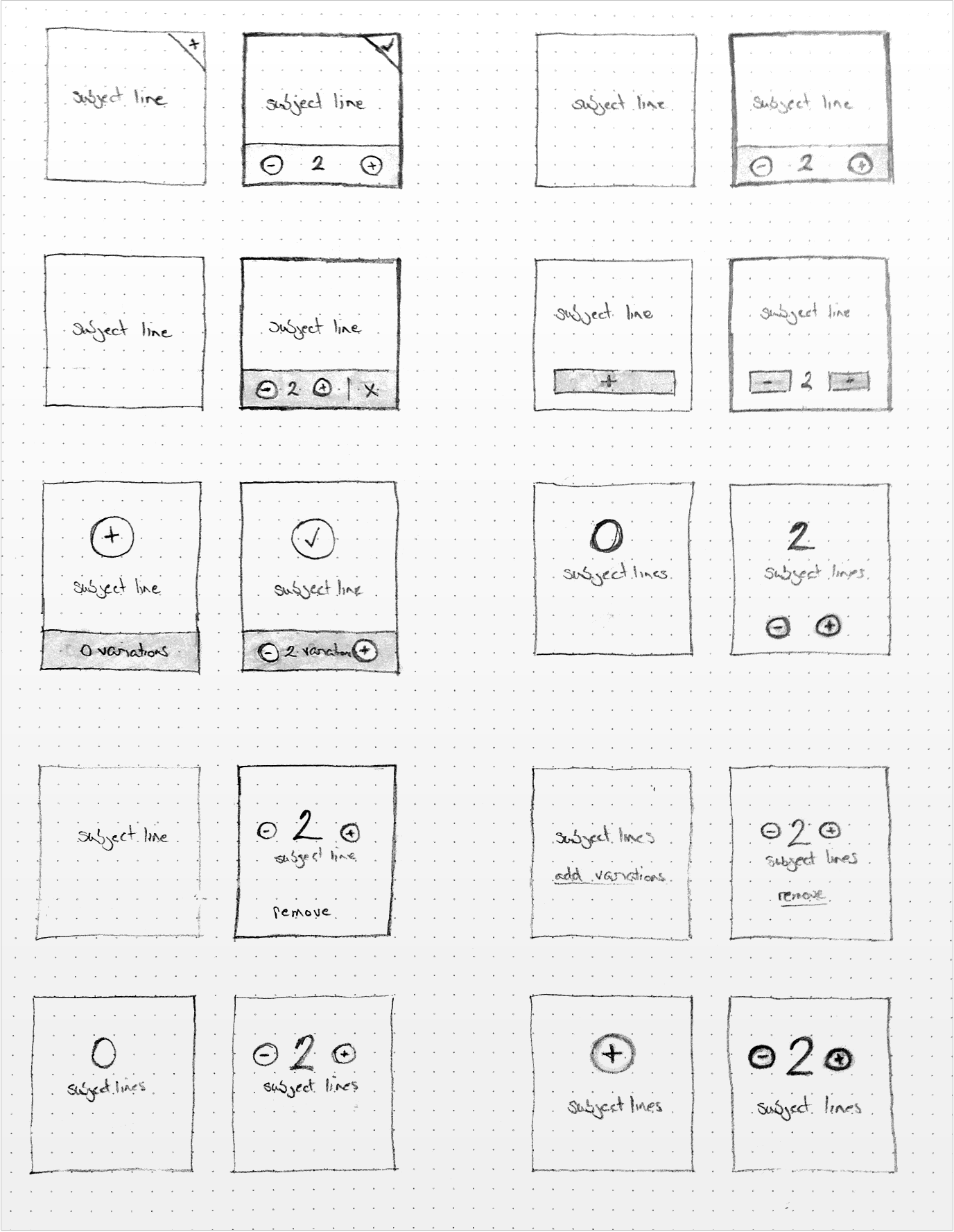
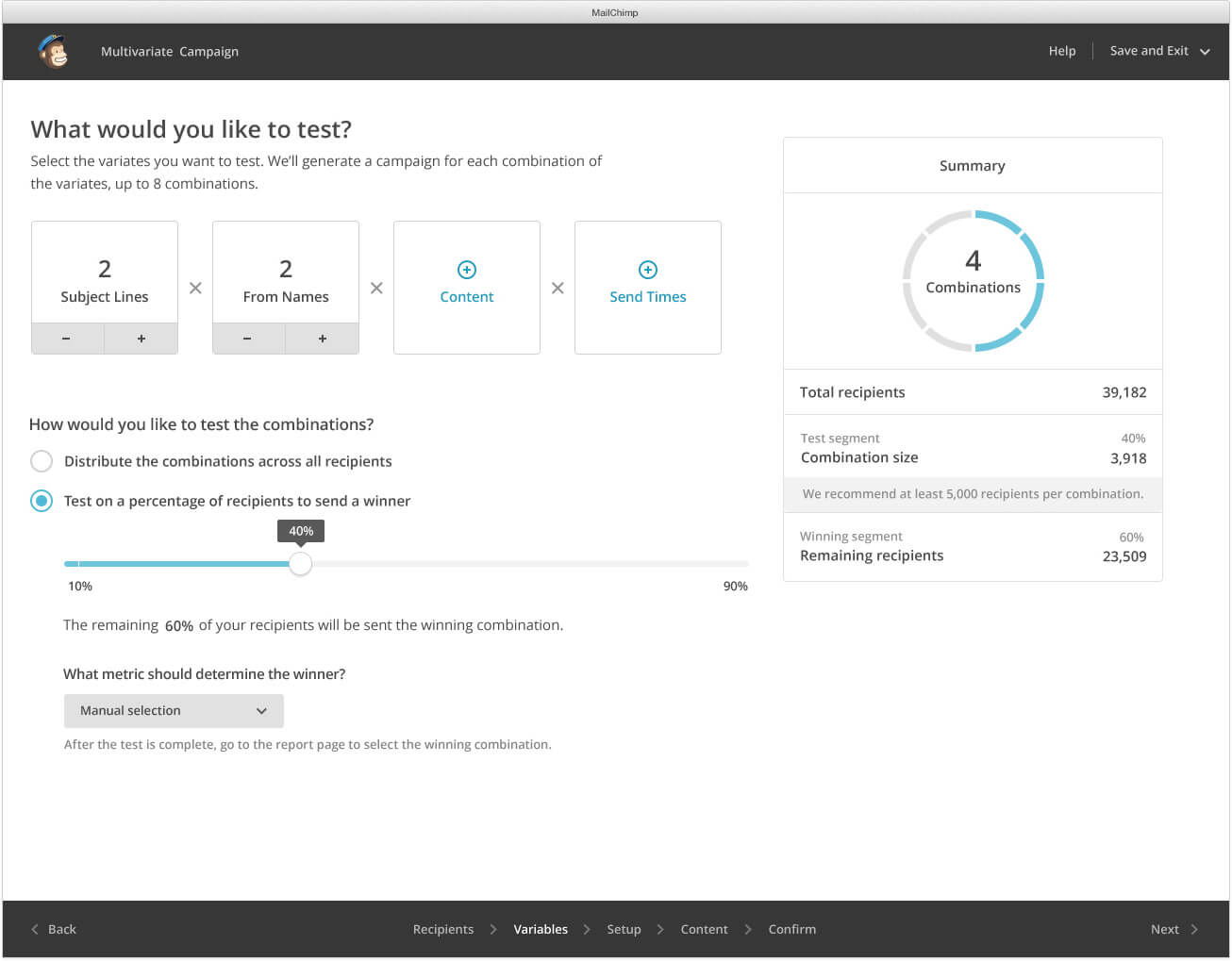
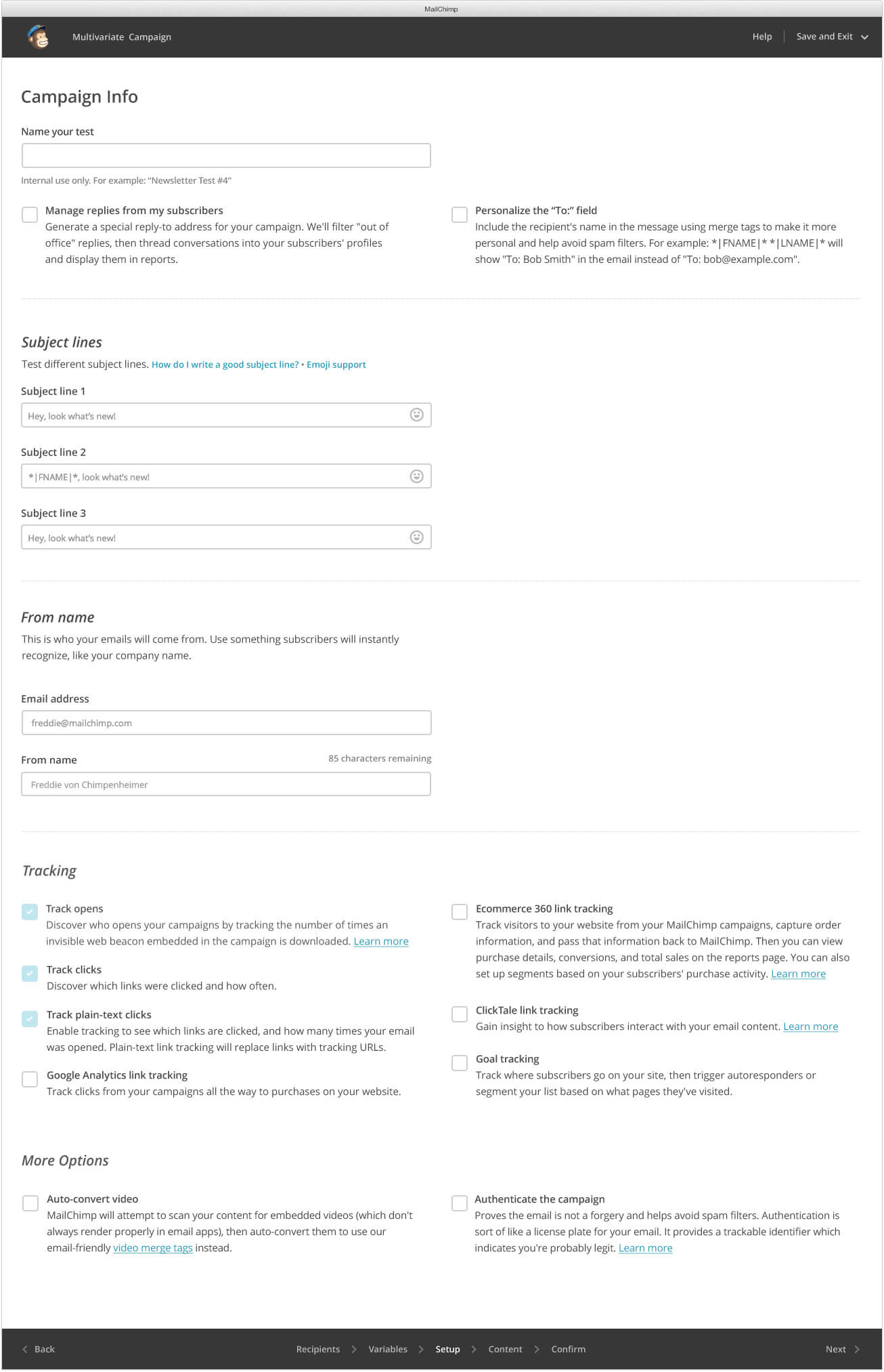
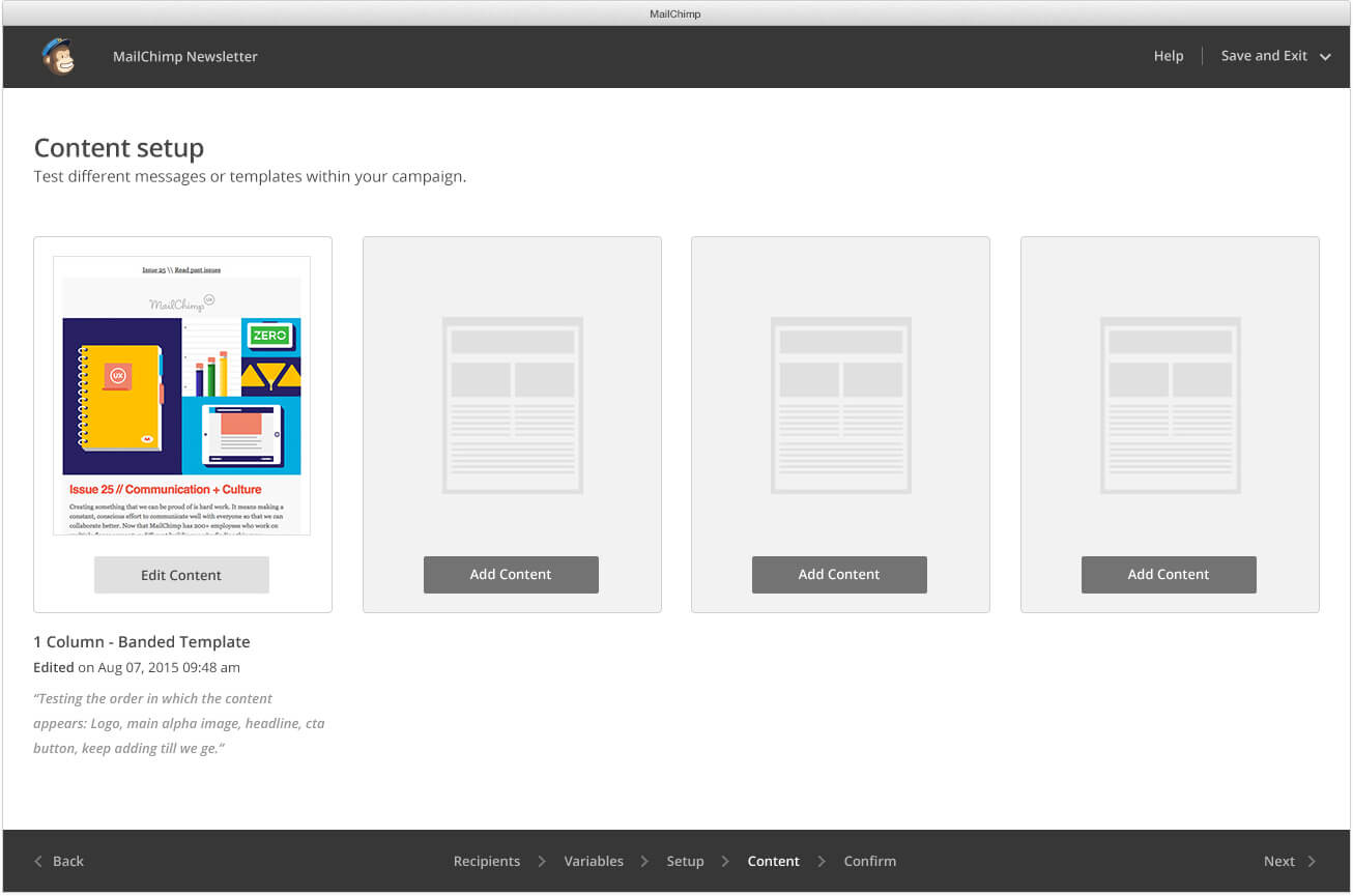
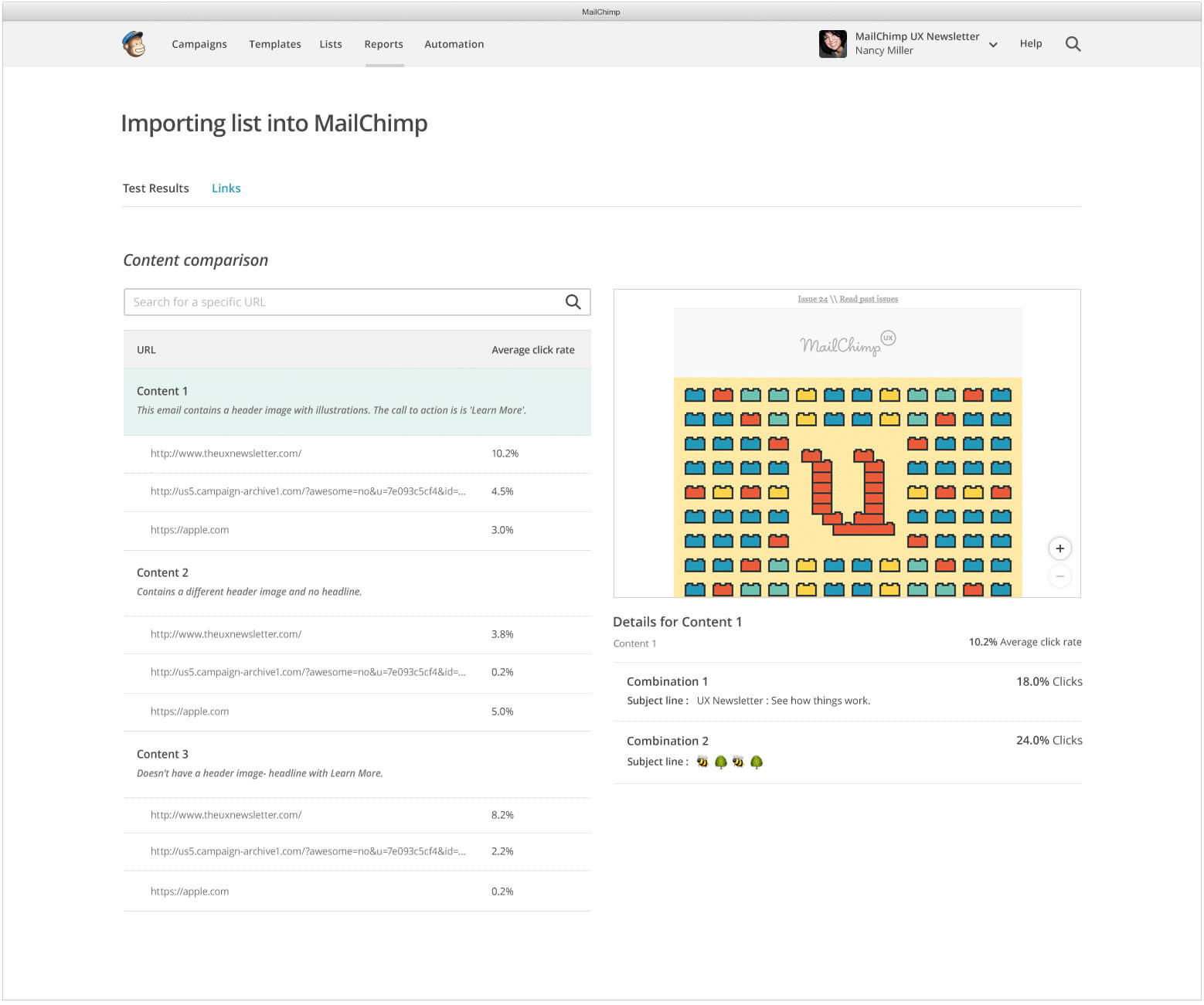
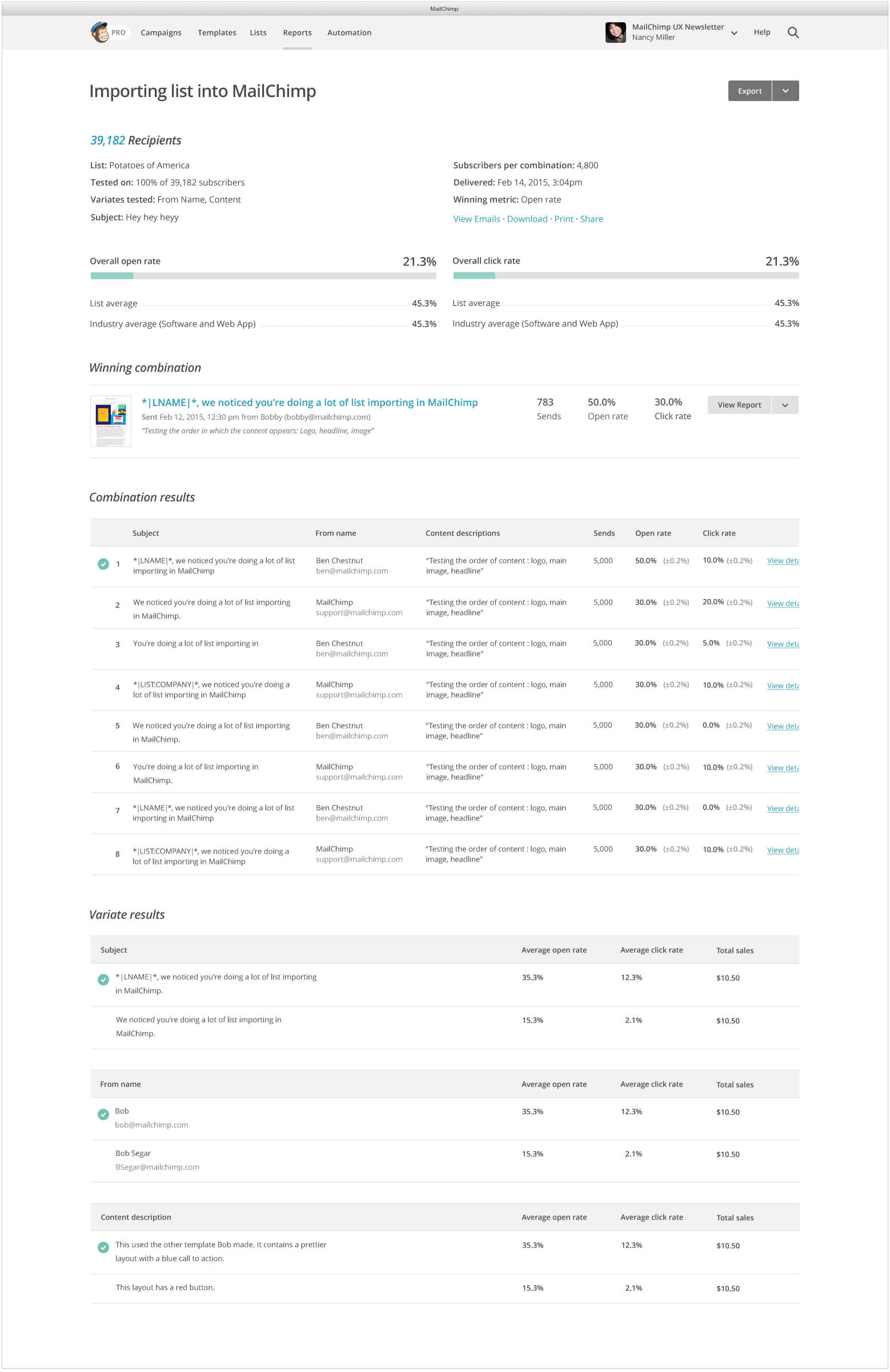
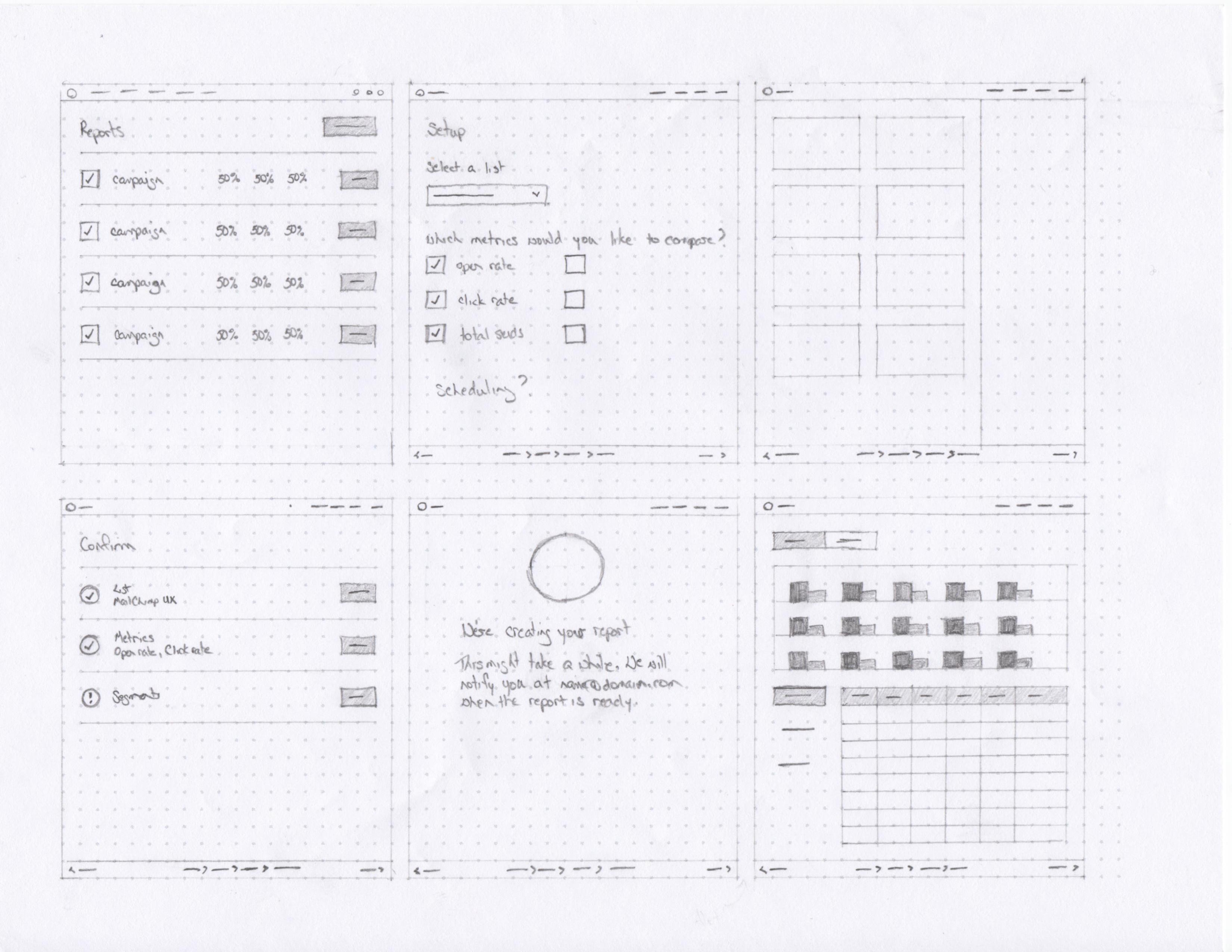
A/B testing was a really popular request from customers. They wanted the ability to compare more than 3 emails. They also wanted the ability to test more than a single design element. Our solution was to allow them to test up to 8 different versions of content with Multivariate Testing. For example, users could use Multivariate to test 2 subject lines and 2 from names to compare the performance of 4 different campaigns. After a test was created, a report was generated that let the user compare the results of each combination and the results of each variable.
Early sketch for the content comparison feature in a multivariate test.Initial sketch for the multivariate report.The layout for variables step in a multivariate test.Various sketches for the variant selection interface in a multivariate test.In the final version of the variable page, the user selects their variants along with how they would want to test the combinations. As selections are made in the left column, the right column explains how the user's list would be affected.Users would setup their multivariate test from this page.Users would add content to each campaign in their multivariate test from this page.The final version of the content comparison page for a multivariate test allowed users to hover over the rows in the left column and see a preview of the content in the right column.The final version of a report from a multivariate test.
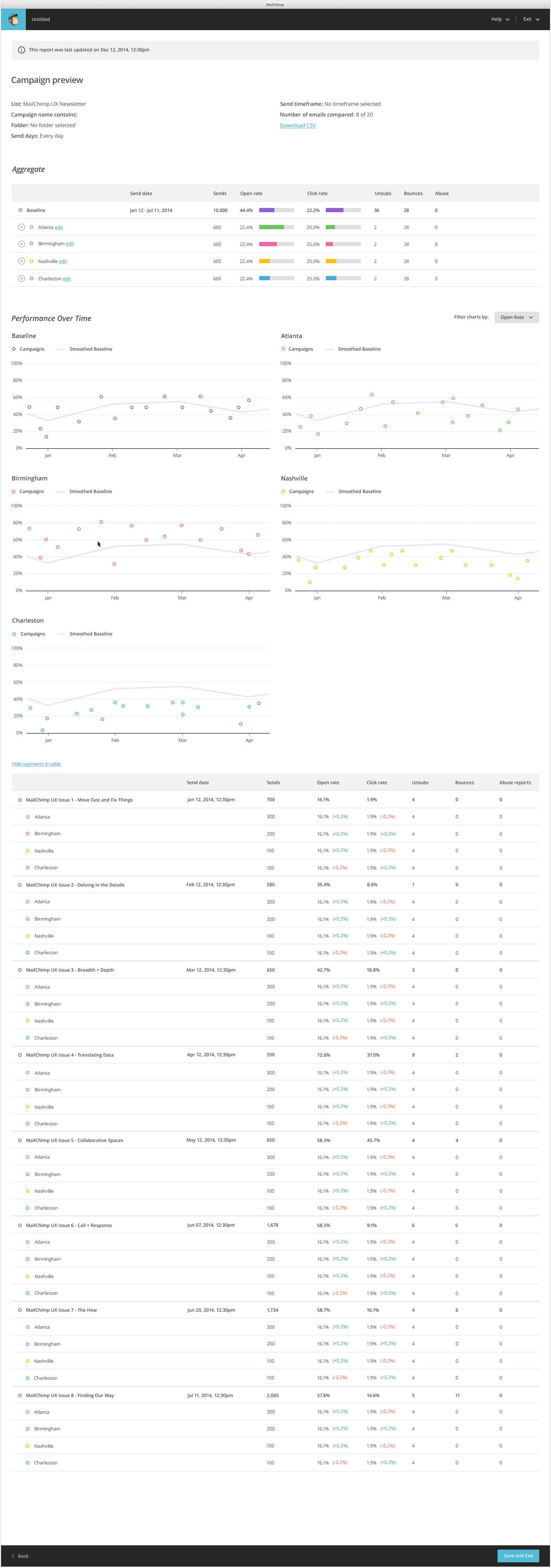
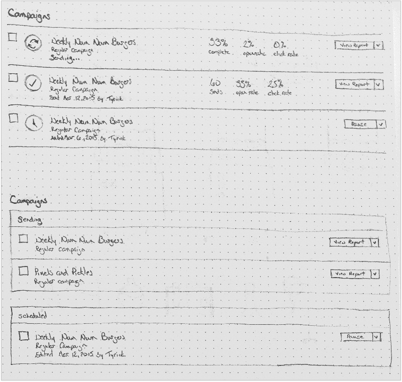
Comparative Reports
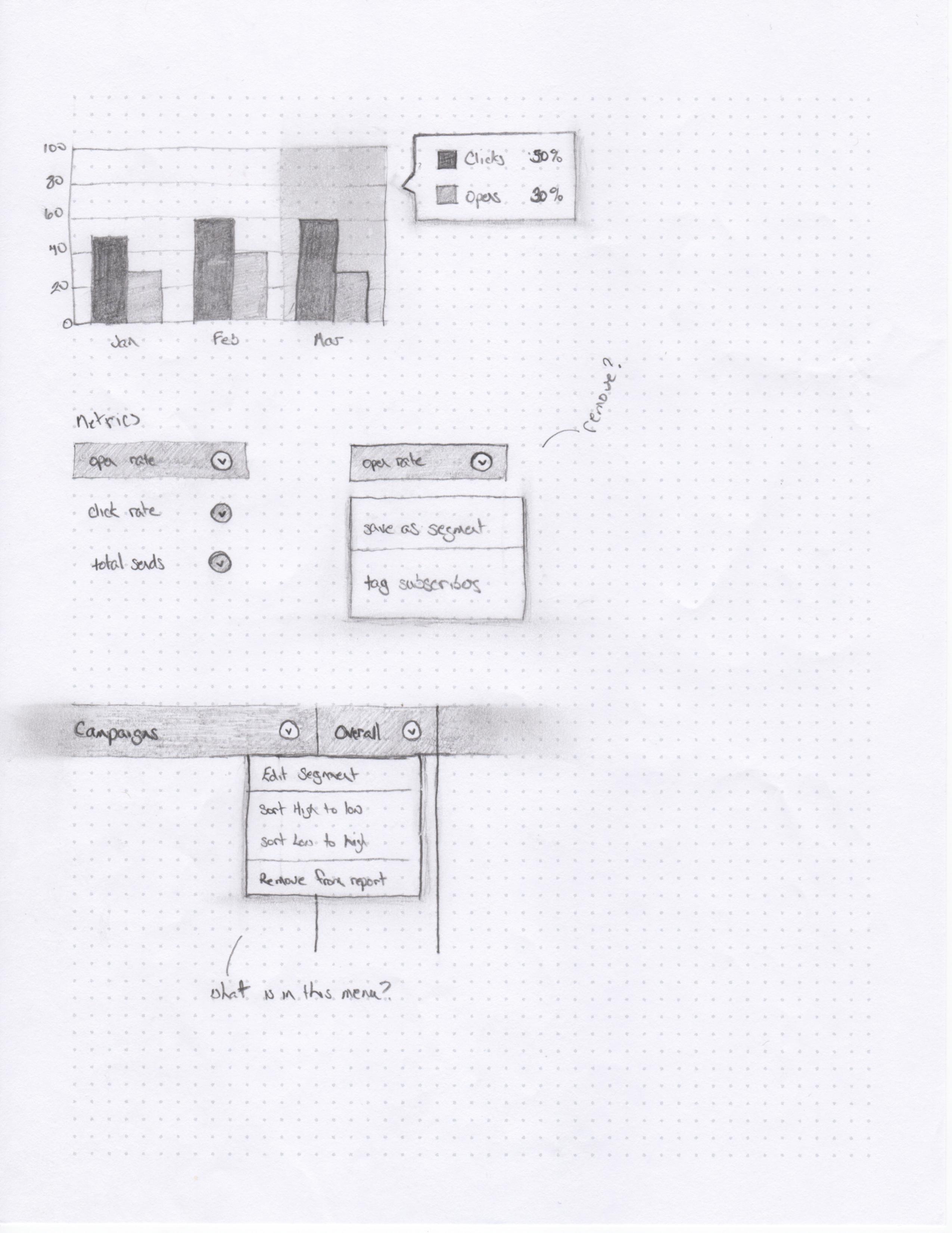
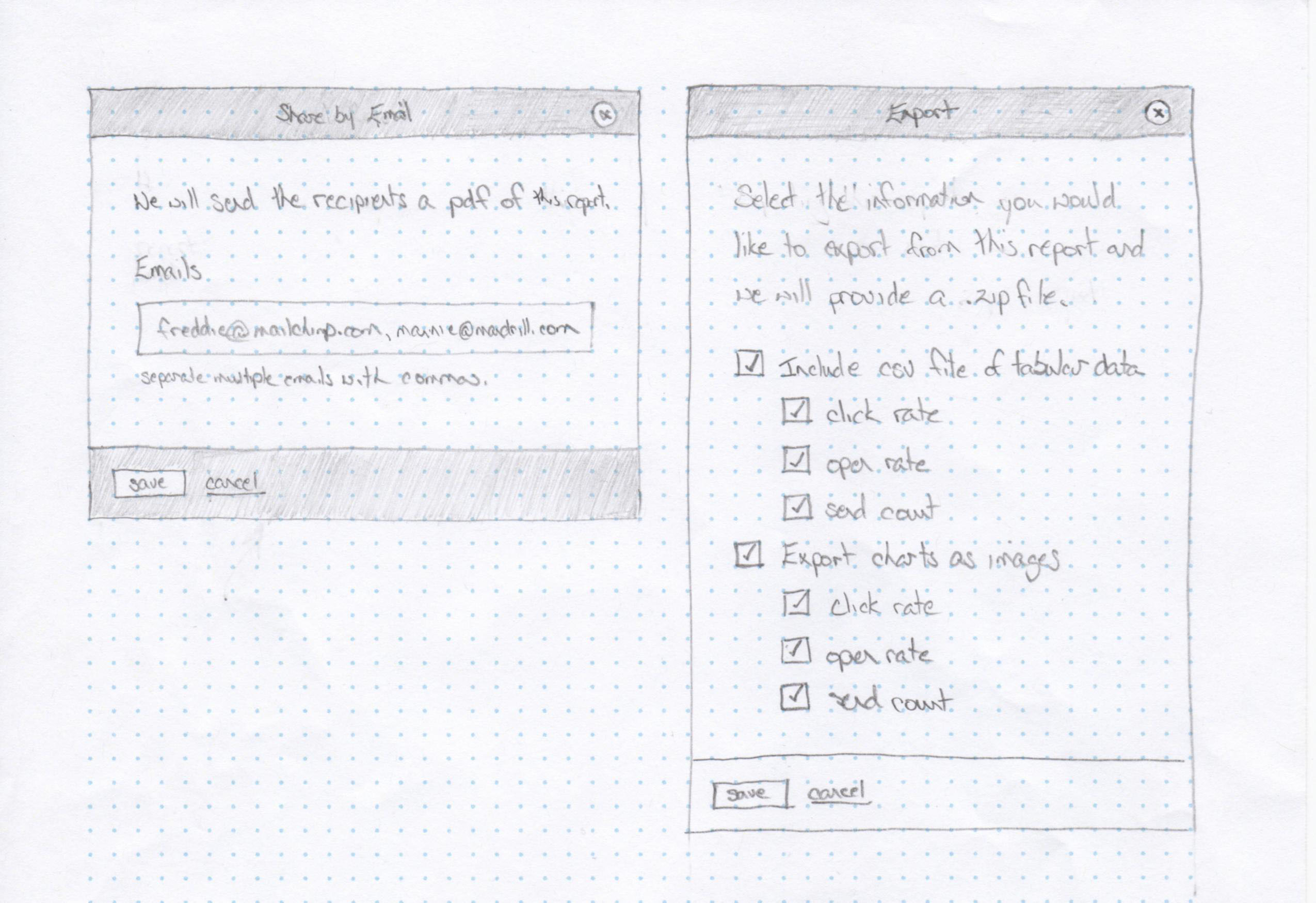
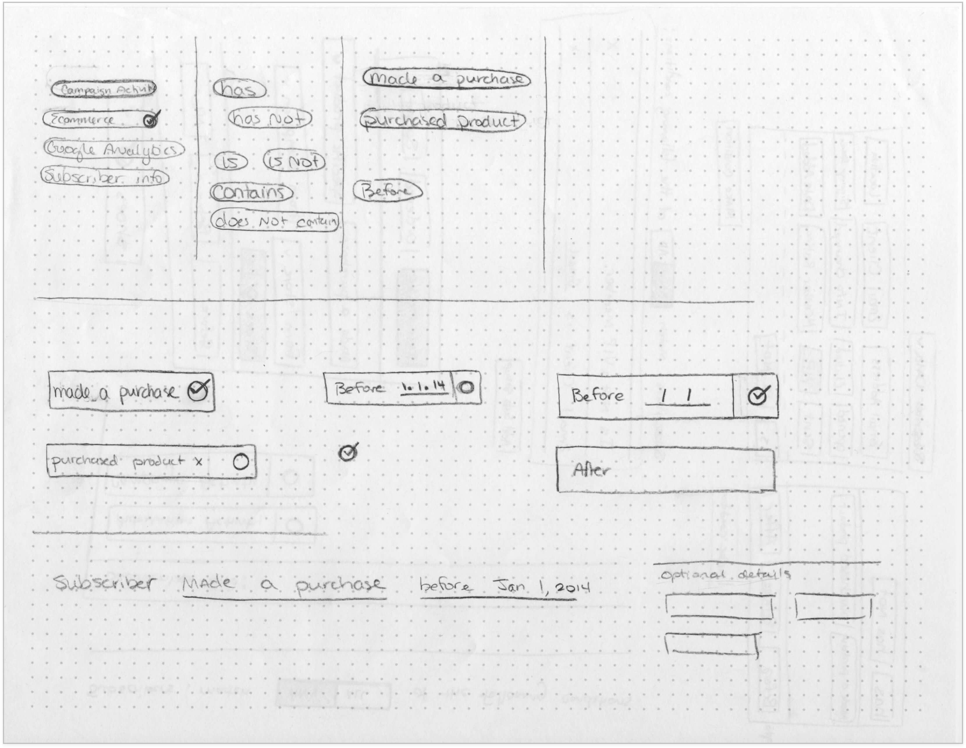
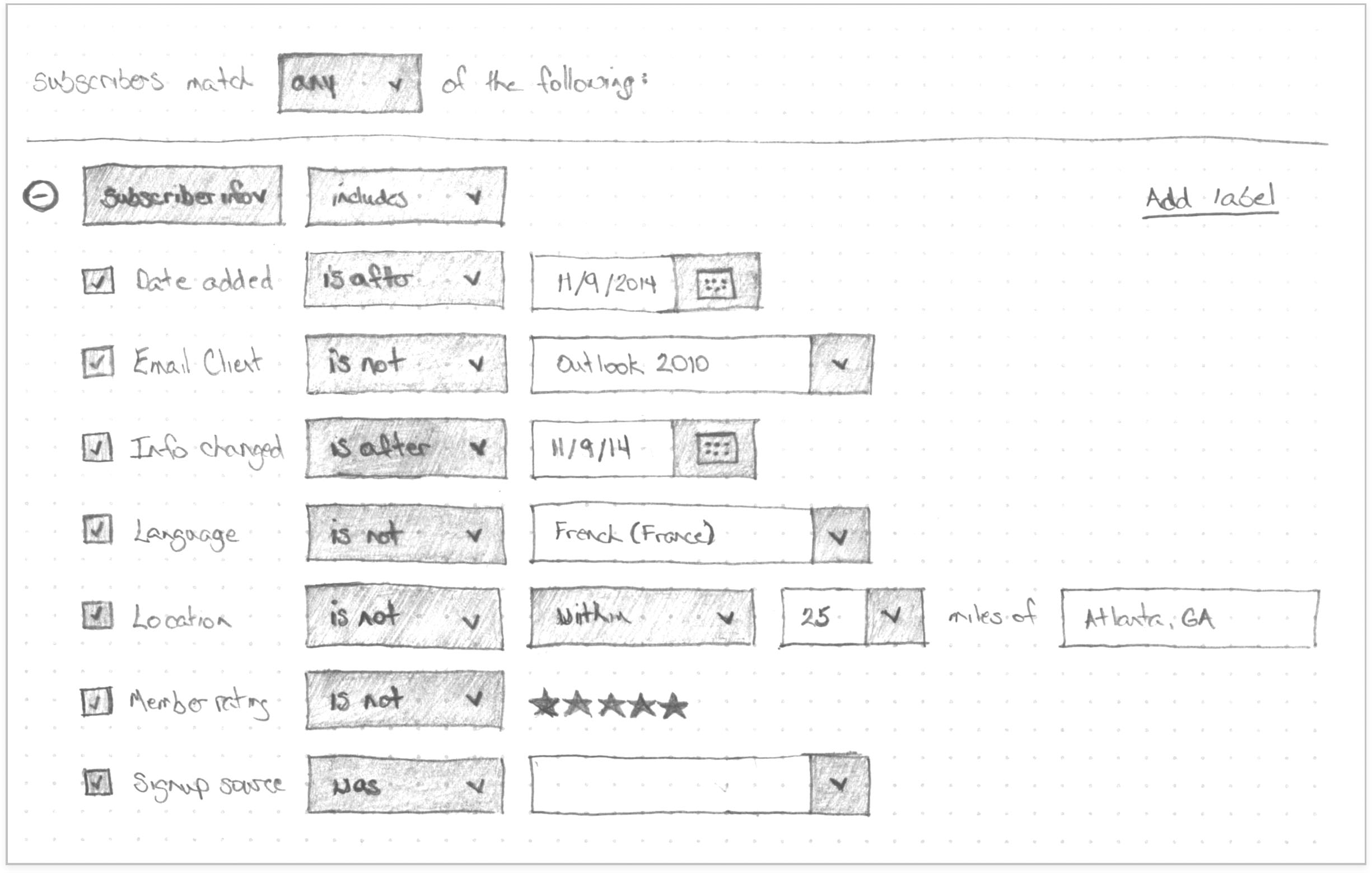
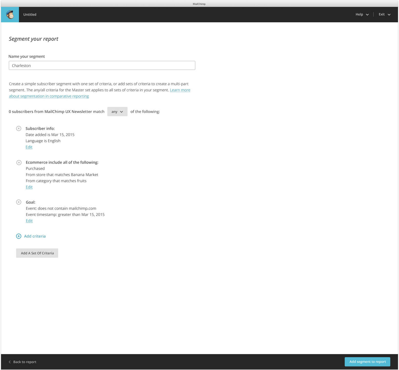
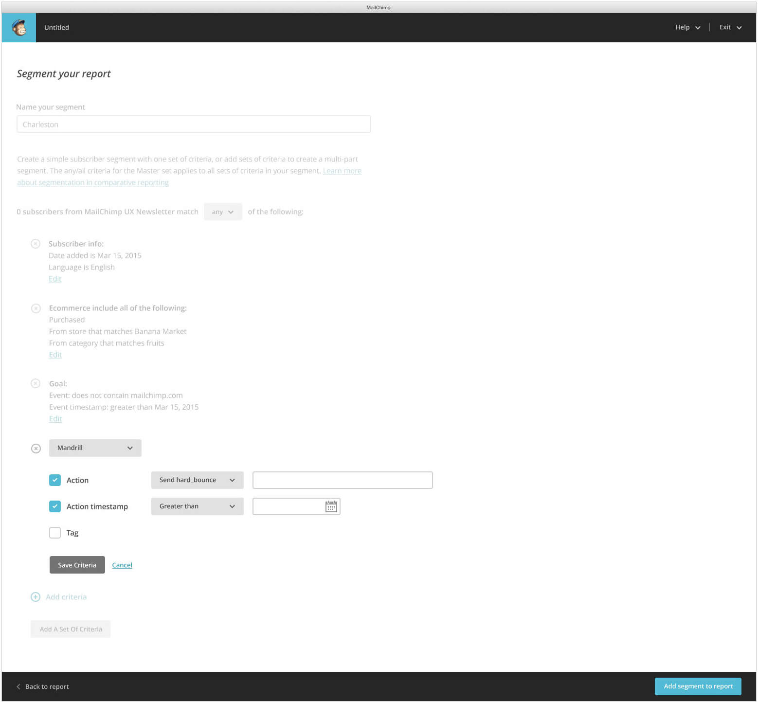
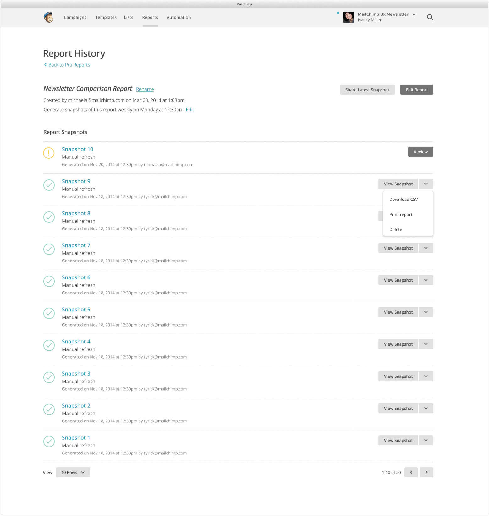
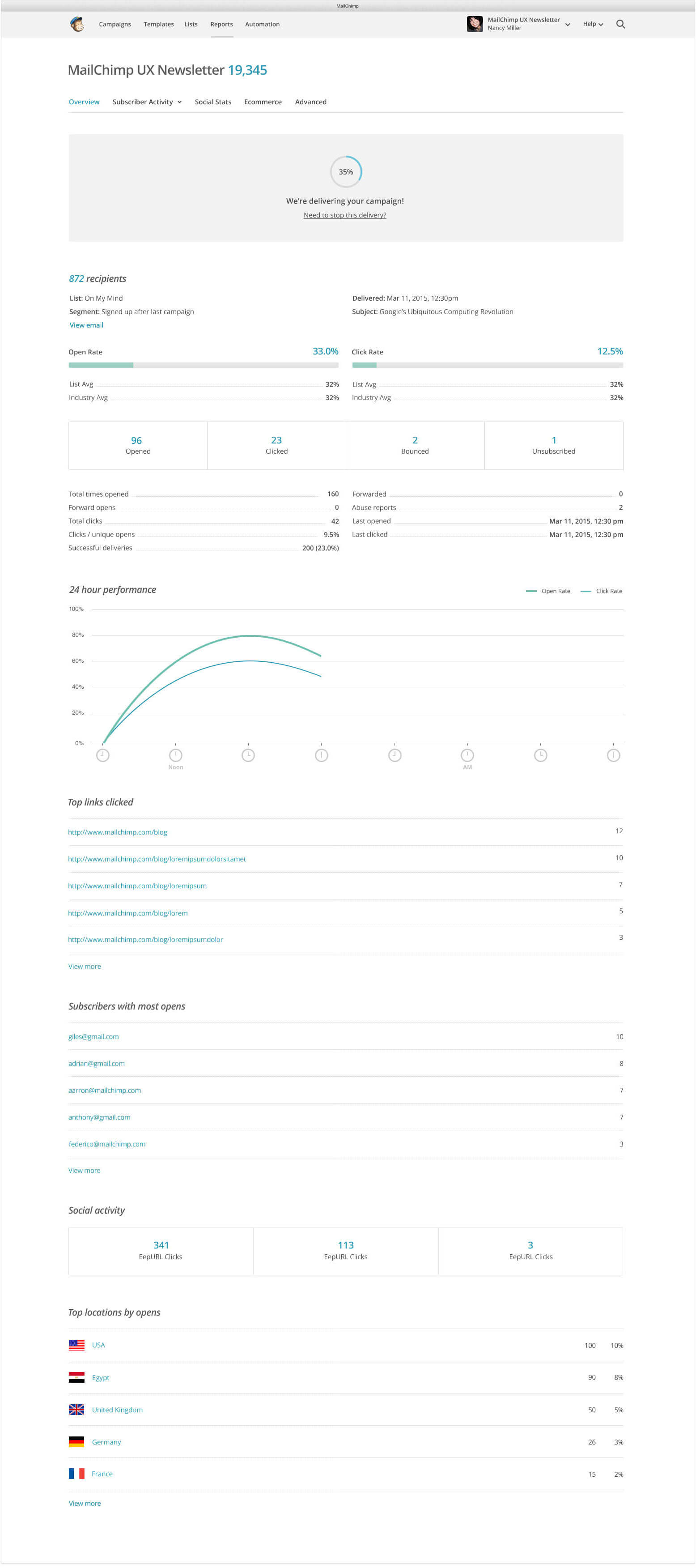
We noticed a trend while examining customer feedback: users were manually creating spreadsheets of stats from each campaign they sent so they could track their performance over time. To simplify this process, we created a tool that let them compare campaigns sent to a list, then generate a report based on the selected campaigns. These campaigns could be manually filtered or dynamically filtered based on timeline, number of emails sent, title, and day sent. After the users selected the campaigns and generated a report, up to 4 subscriber segments could be added. This allowed users to discover trends or gain a better understanding of their subscribers by creating segments based on topics like gender, purchase preferences, or location. Within the report, the user could compare the open rate, click rate, unsubscribes, bounces, and abuse rates of the baseline against the segments. This report could then be saved, scheduled to generate over time, or shared.
Menus and popovers in comparative reports.Comparative report modals.An early version of the workflow for comparative reports.An early idea for segmentation was to create a rule using a mad lib approach.A sketch we used to build the final version of the segmentation interface.The filtering step of comparative reports allowed the user to select any campaigns sent to a list.The final version of a comparative report with 4 segments added.The final version of the segmentation interface.As criteria were added to segments, the opacity of the interface would be reduced to allow the user to focus.The final version of the history page for comparative reports.
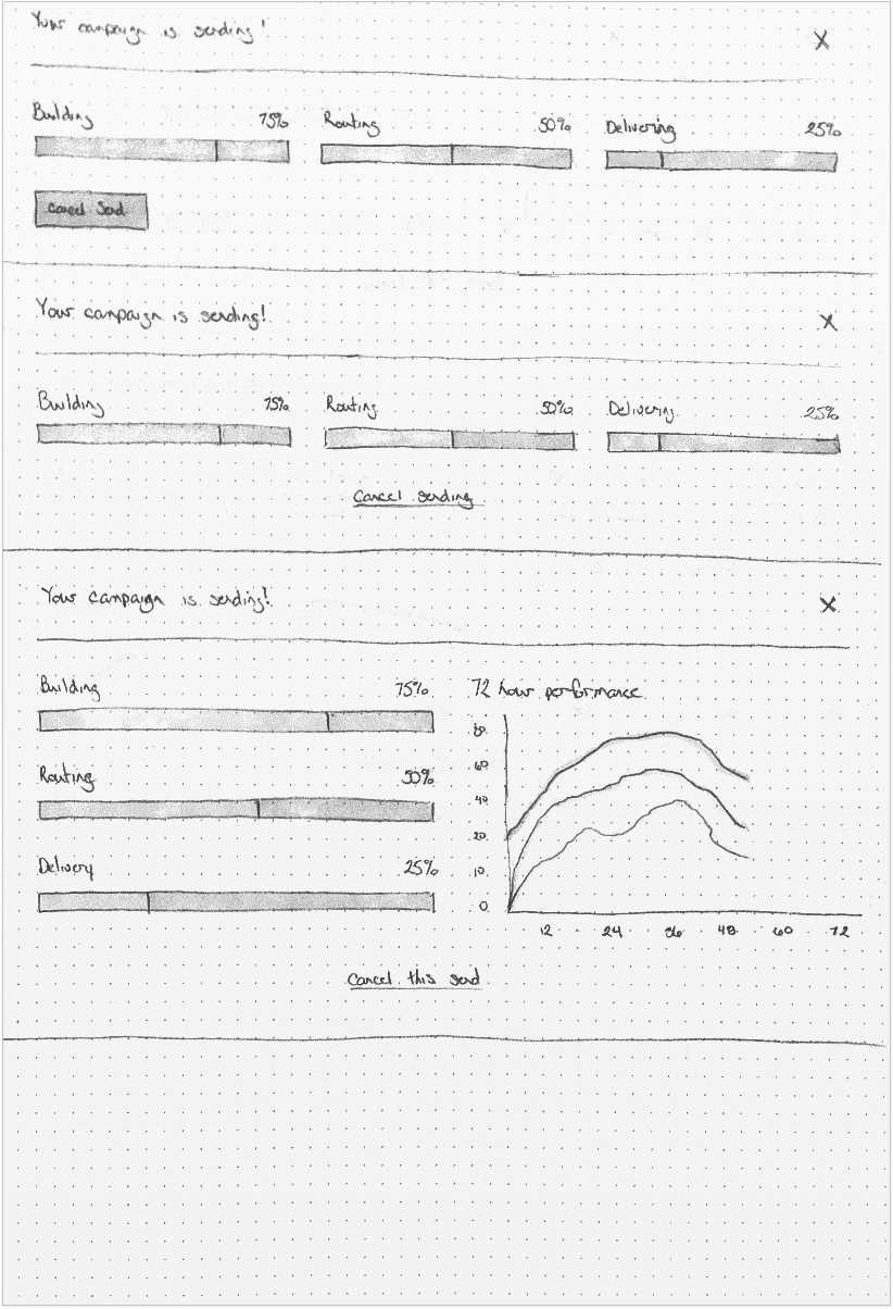
Delivery Insights
After sending a campaign to a large list, it was often difficult for users to understand when the campaign started sending and how many campaigns had been sent. To make this process more transparent, we created a feedback block that appeared on a report after a campaign was sent. Here, users could see the status of the sending process for the campaign. We also presented users with an option to cancel the send. If the user decided to cancel the send, MailChimp would then create a segment based on the subscribers who received the campaign before it was cancelled, allowing users to quickly send a follow-up response to anyone who accidentally received a campaign.
Variations of dashboard slats indicating the delivery status for campaigns.Variations of feedback blocks for delivery status that would appear above a report after a campaign was sent. Early in the process we were thinking about showing more information however after seeing a prototype we realized it was too confusing.The final version of delivery insights was a feedback block that appeared at the top of a report as the campaign was being sent.
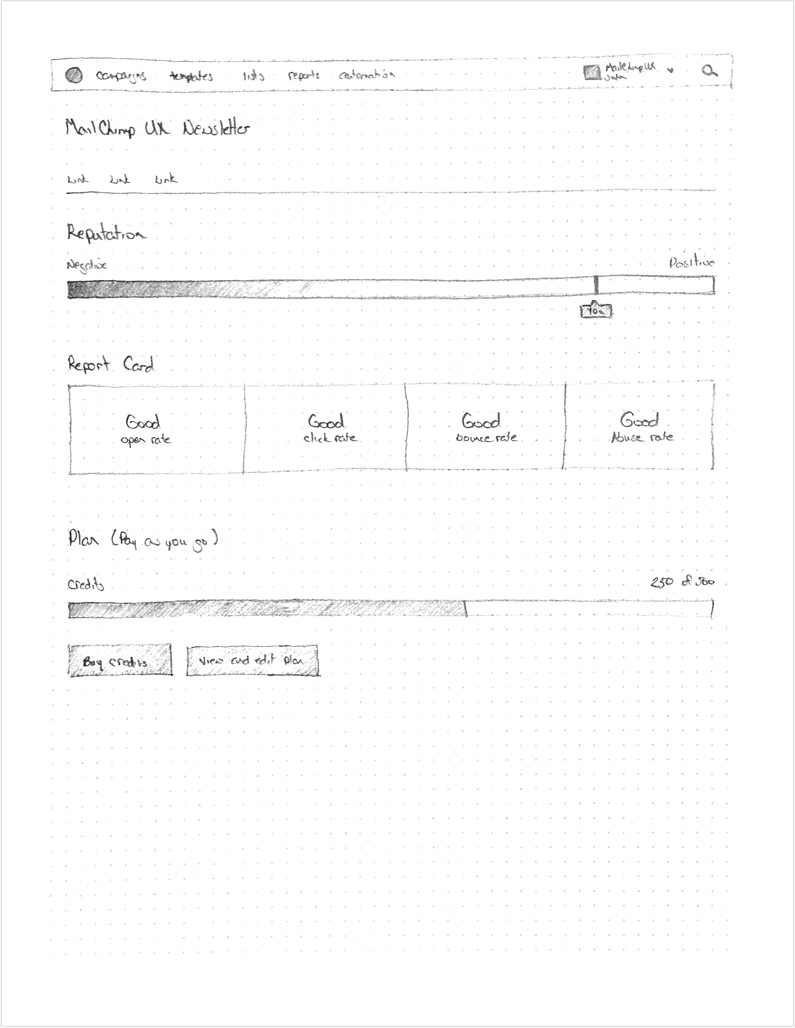
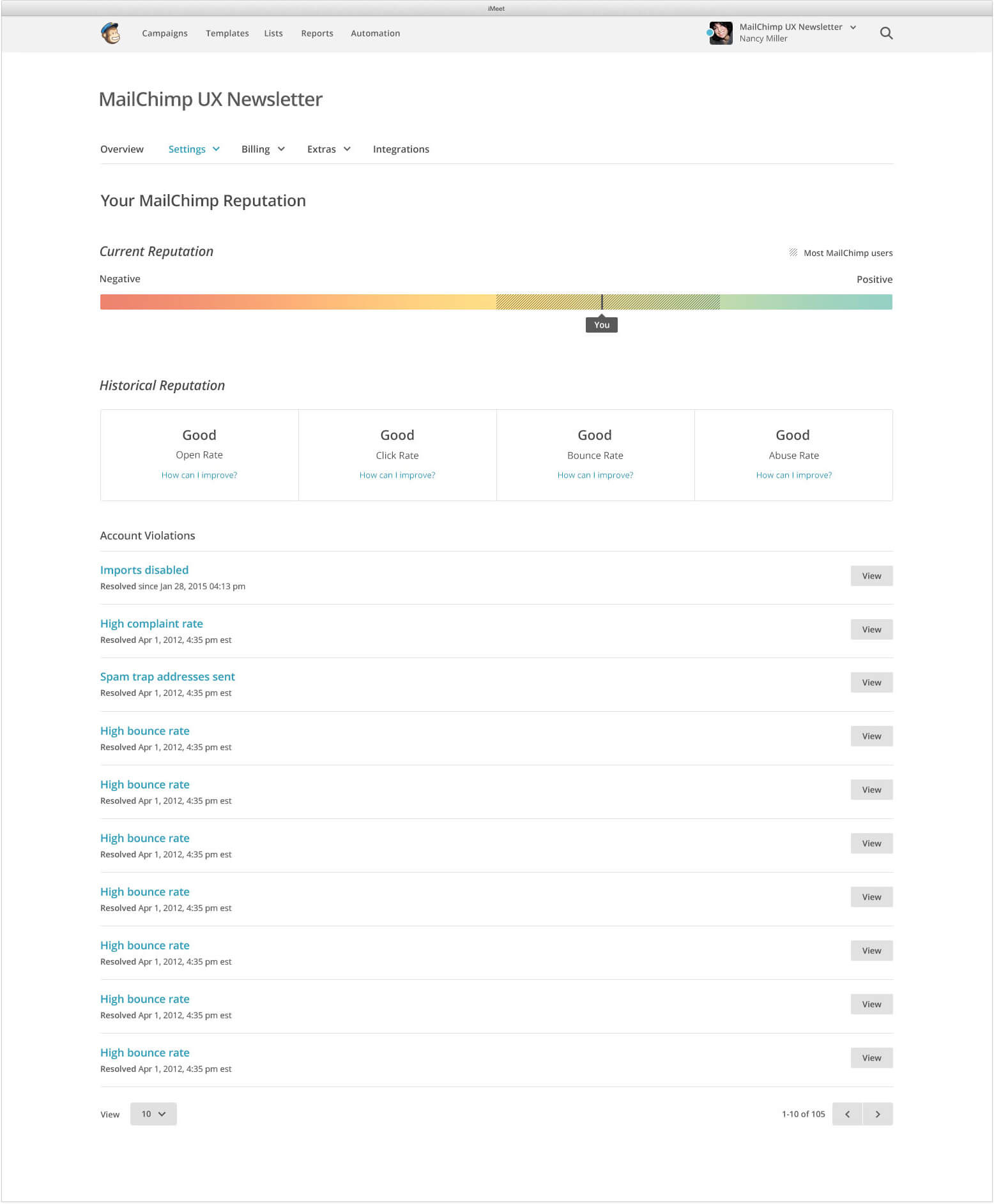
Compliance Insights
Users were often unsure about what MailChimp’s Compliance process entailed. This sometimes lead them to worry if they were doing something wrong, if their account was in good standing, and, in some cases, if their business was at risk. Compliance Insights was created to allow users to answer those questions on their own. We exposed 2 parts of the compliance process to users: their current and future reputation. By examining these pieces of data, users can now see what they’re doing well, what they can improve, and their current reputation.
An early sketch for the compliance insight interface.The final version of the compliance insights interface.