In 2010, MailChimp introduced free accounts which increased the company’s user count from 85,000 to 450,000 in one year. This growth necessitated a flexible style guide that allowed MailChimp to build features quickly, efficiently, and consistently.
The Solution
I worked with a team of designers, developers, and writers to create a style guide that allowed MailChimp to focus on their existing desktop users while also planning for future mobile users. This responsive style guide was created using Brad Frost’s atomic design principles which allowed our team to think about how small elements could be assembled into larger components, templates, and pages.
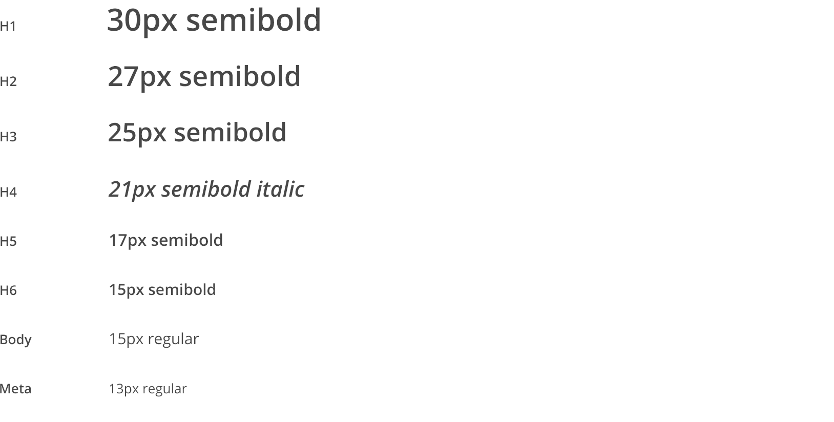
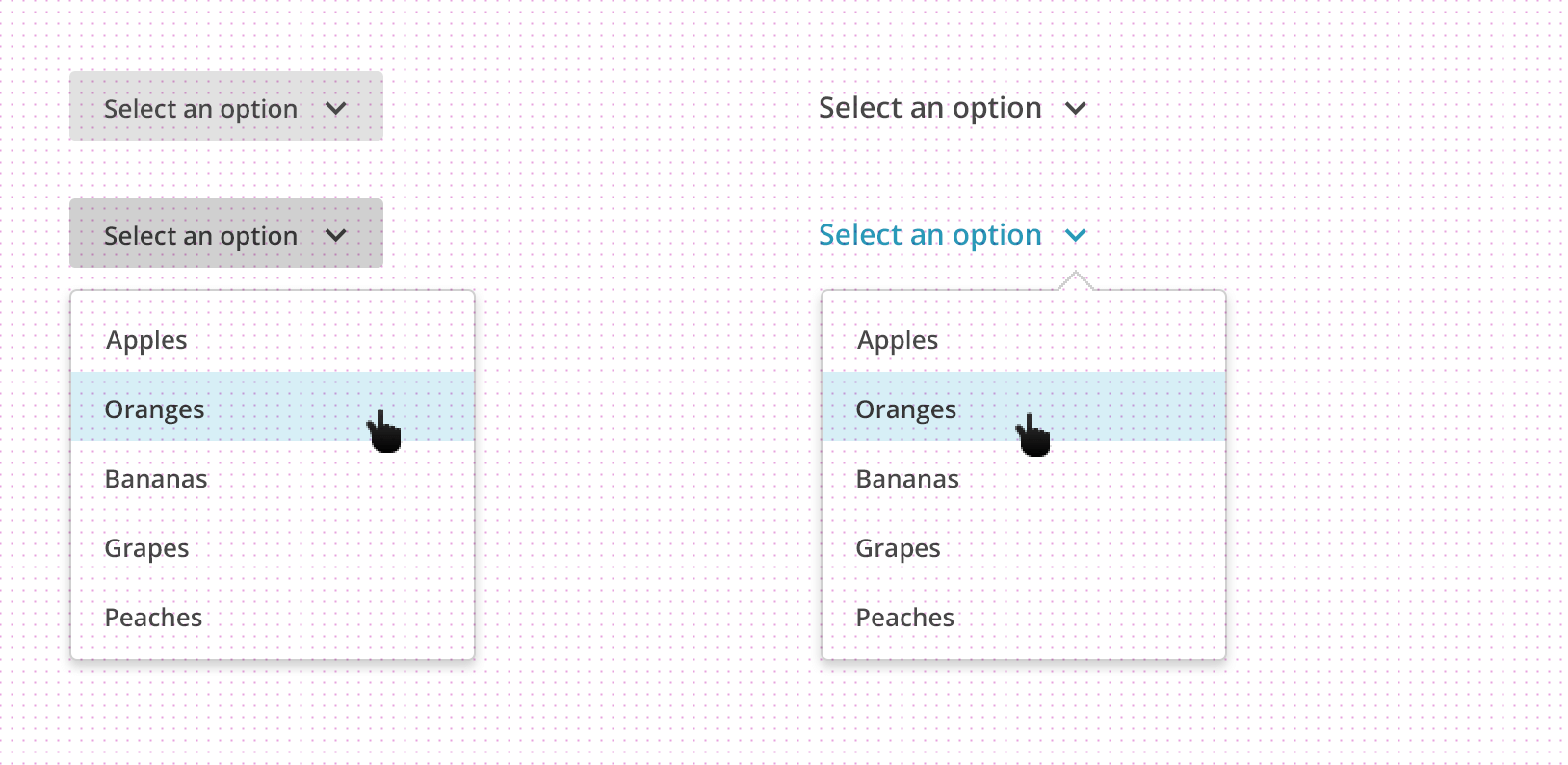
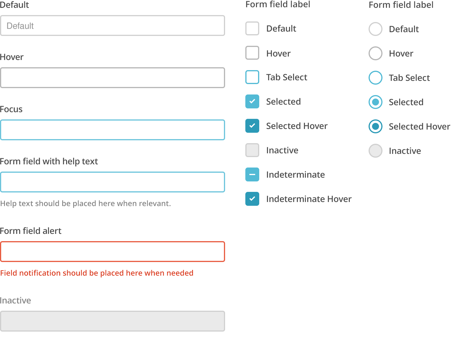
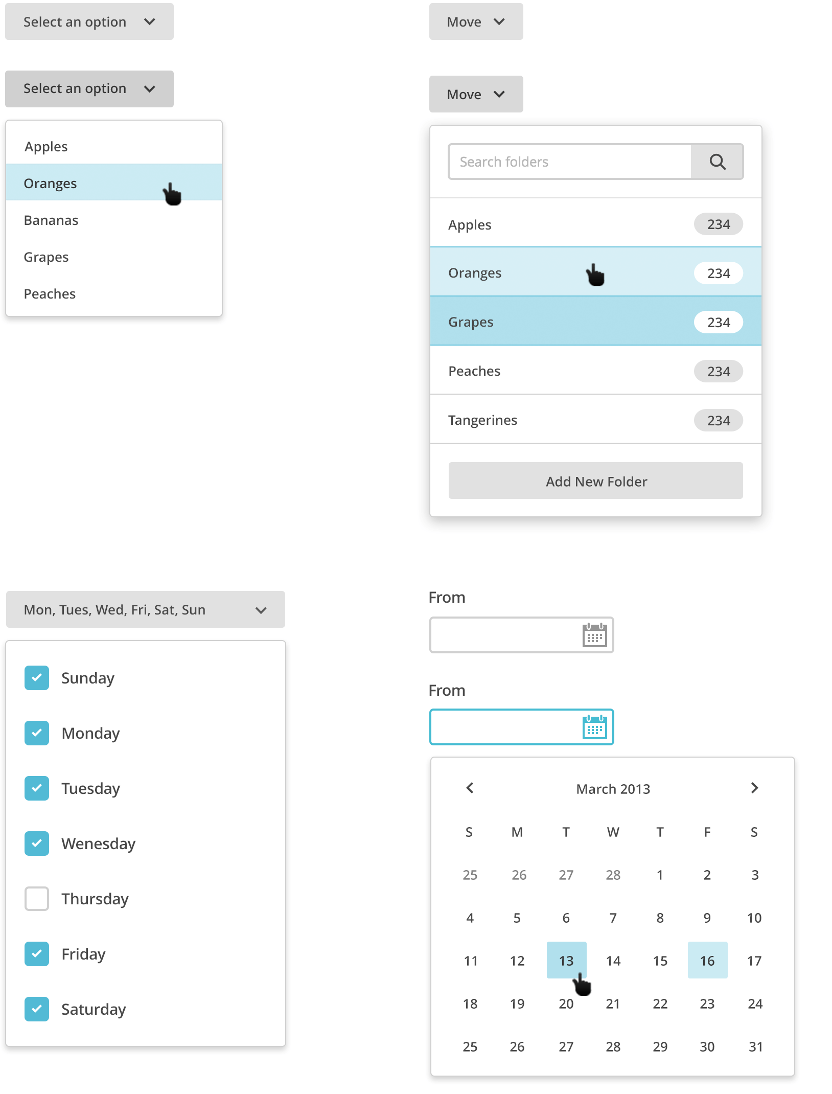
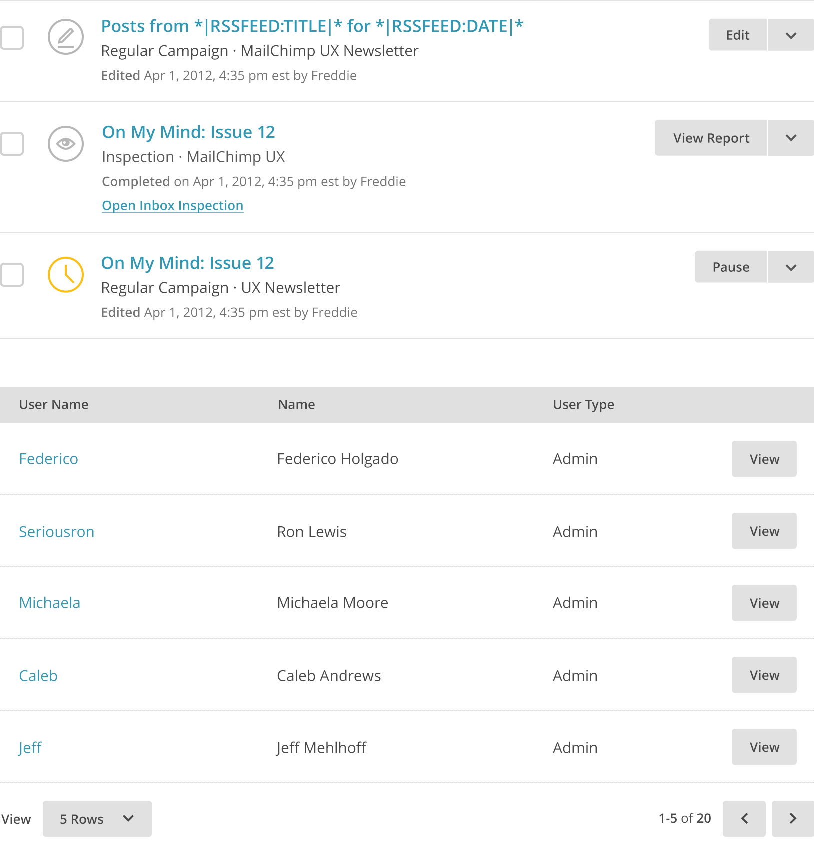
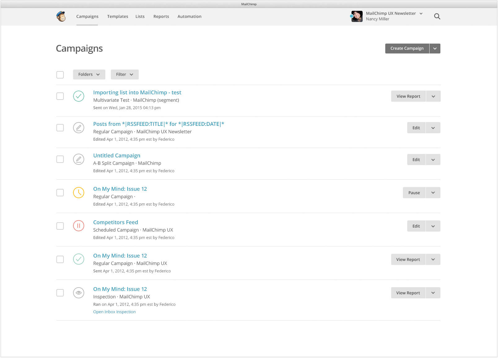
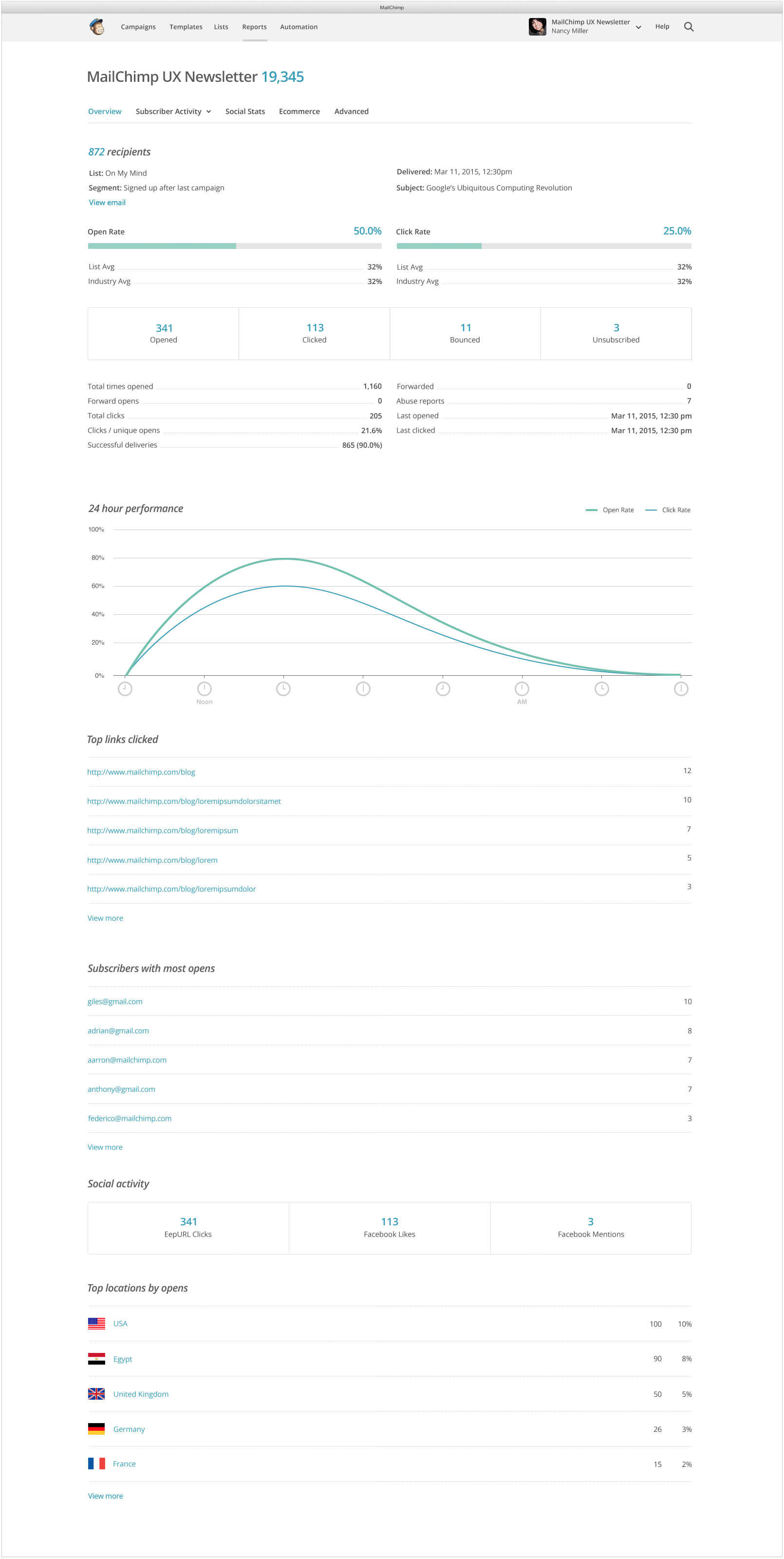
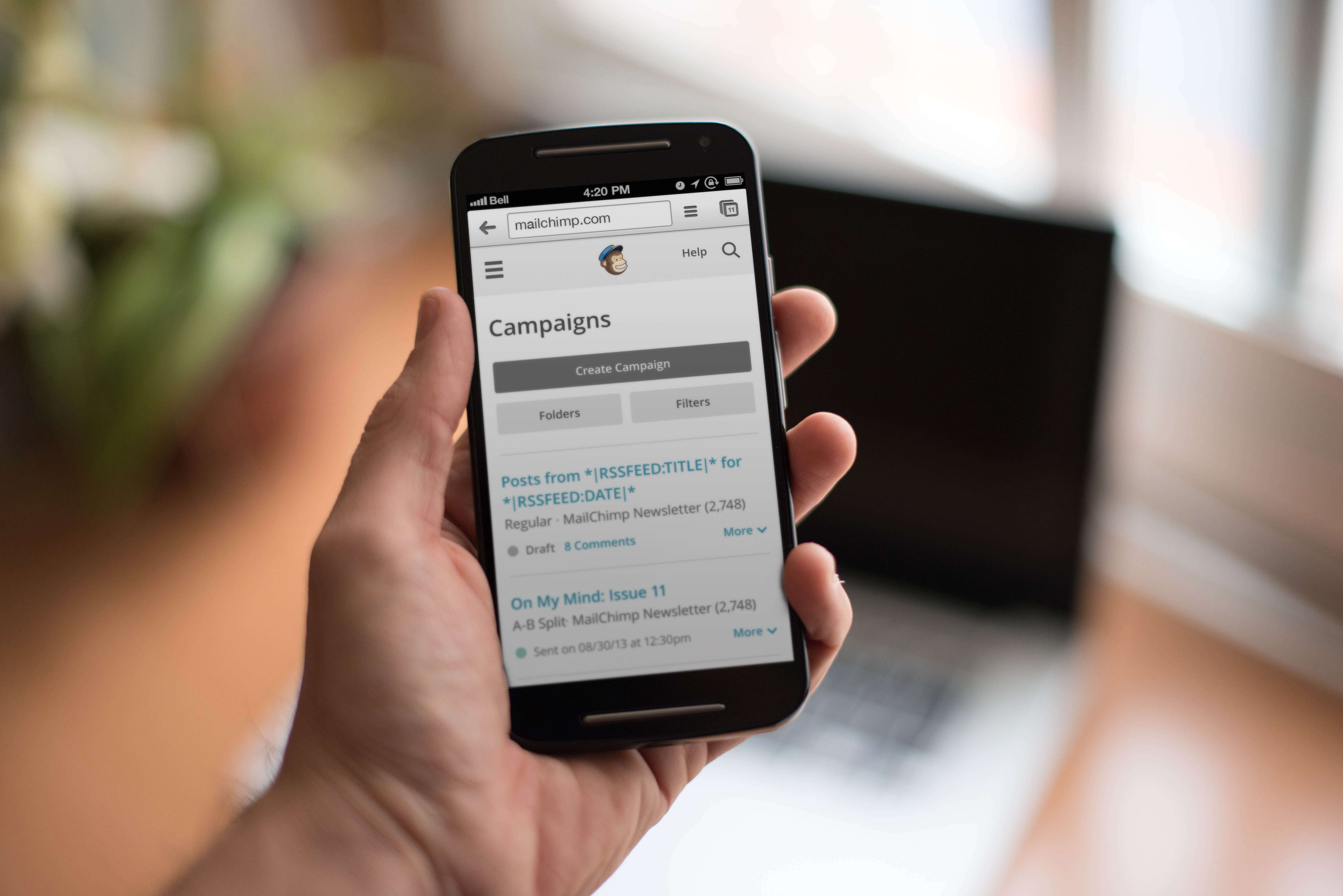
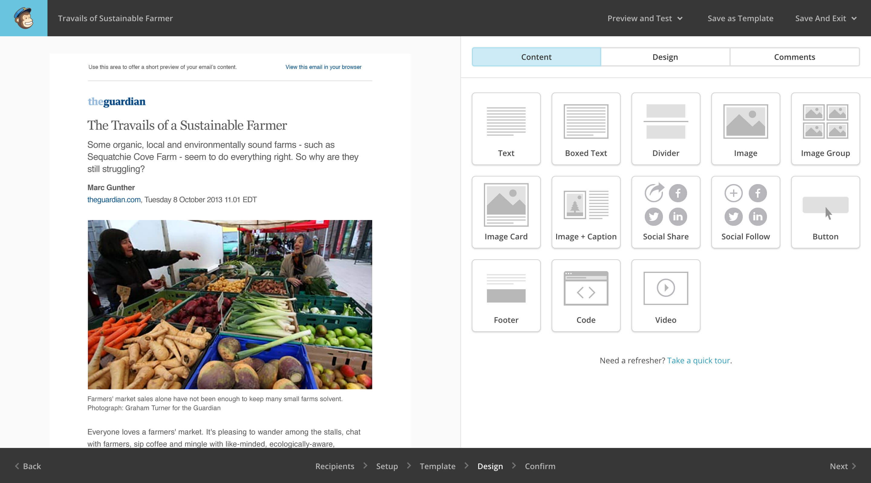
During the redesign I placed work on walls around the office so team members could provide feedback throughout the process. Photo by Jason Travis.We started the redesign process by selecting a new typeface. Open Sans added some personality to the app. Then, we applied a Minor Third scale to the typography to add some rhythm and hierarchy to the page.After auditing all of the icons in the app I worked with Caleb Andrews to create a new set that was more consistent.We based each piece of the pattern library on a measurement of 6 because the line-height for headings and paragraphs could be divided by 6.The interface started to take shape as typography was combined with basic form elements and the grid.After defining the typographic scale and creating some basic UI elements, the design language was extended to select menus.Small elements were combined to create larger components like tables and slats.When the style guide seemed complete, components were assembled into pages.The reports overview page used a variety of components including graphs, meters, stat blocks, stat lists, and tables.While creating the pattern library and designing pages, we also planned for smaller devices.
The Results
Today, MailChimp has more than 14 million users and sends nearly 27 billion emails each month. A style guide allowed us to easily accommodate this growth by streamlining the process to design, build, and maintain the web app. In 2014, MailChimp was awarded a Good Design Award, Net Award, and 4 Webby nominations for these improvements.
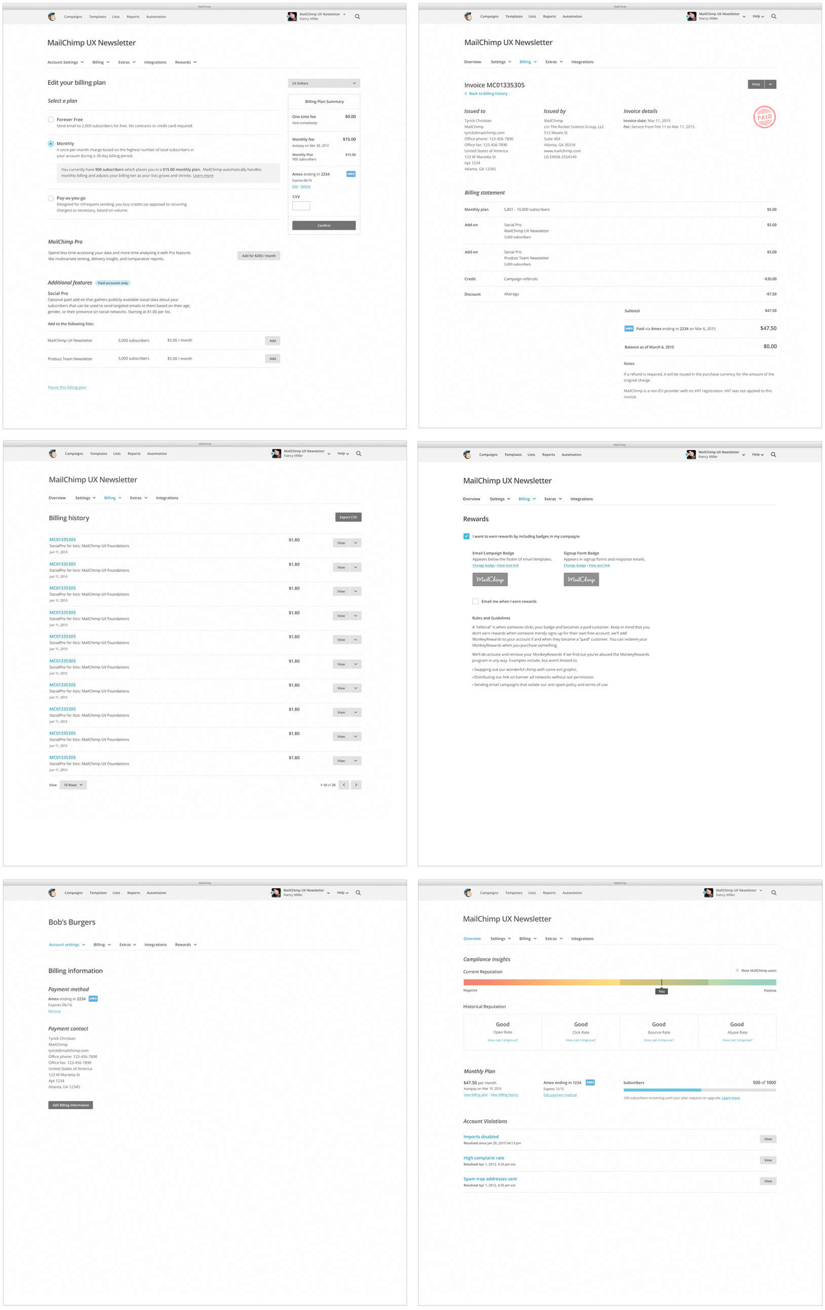
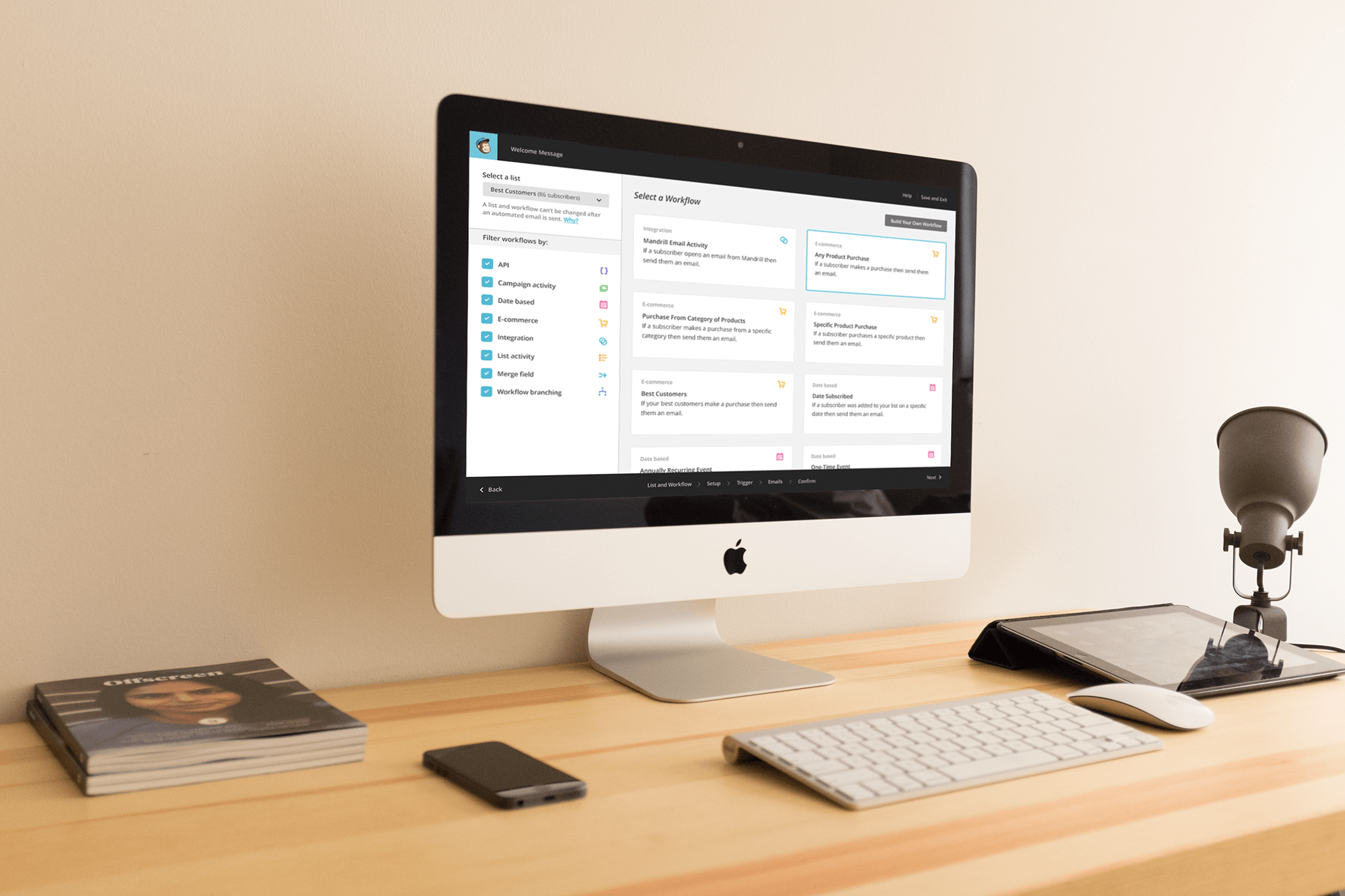
Creating a pattern library provided more time to focus on larger features and workflows. One of those features was the MailChimp drag and drop email editor.There was also more time to focus on large workflows that affected every type of MailChimp customer, such as the billing workflow shown here.In addition to refining workflows that affected every type of MailChimp customer, I also focused on workflows that were specific to paid accounts like Automation, shown above. Refining this process helped MailChimp increase its Automation users from 92,000 to 140,000 in one year. Those users sent 350 million automated emails.